
Cut build time. Keep every pixel on-brand.
If your Figma -to- Webflow handoffs still feel messy, here’s the truth:
A well-built style library can turn a week-long build into a few focused days — and make every update effortless.
Why bother with a style library?
Because it’s your single source of truth — for you, your team, and future you.
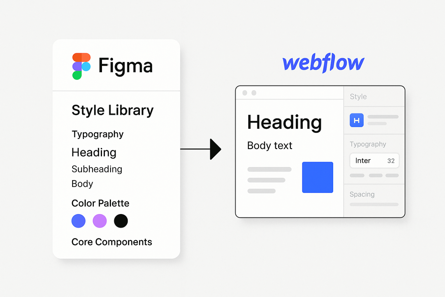
Here’s what to include:
- 🅰 Typography – headings, body text, sizes & weights.
- 🎨 Color palette – primary, secondary, accents (HEX/variables).
- 📏 Spacing & grid – 8px/4pt baseline, paddings & margins.
- 🔲 Core components – buttons, inputs, cards, CTAs.
Design it once in Figma. Reuse it everywhere.
From Figma → Webflow: the 5 wins
- Faster builds – map Figma styles to a Webflow Style Guide page before building.
- Consistency – every page stays on-brand, even as projects scale.
- Collaboration – new teammates instantly “get” your system.
- Rapid iteration – launch new pages in hours, not days.
- Easy maintenance – change once, update everywhere.
💡 Pro tip: Use Webflow’s Design System Sync to bring your Figma colors, typography, and variables directly into Webflow .
Manual setup still works — but sync makes it magic.
Bottom line
A style library isn’t “extra work” — it’s the system that pays you back on every build.
In my projects, it’s cut dev time by 30–40% and made design updates almost instant.
Your turn:
Do you already have a style library in your workflow?
If not — this is your sign to build one today.
PS: In practice, not every client follows a designer’s recommendations.
Some tweak spacing libraries or font sizes on their own — breaking the system.
And sometimes designers themselves ignore their own spacing & typography rules, relying on “eye feel” instead of consistent scales.
That’s usually a sign of inexperience — and it’s why a well-built, documented style library is worth protecting.